Grouped Interviews
For complex interviews with many questions, presenting everything at once can overwhelm users. Grouped interviews divide your questions into logical sections. How those groups are presented is controlled by ui.layout.
ui.layout options for grouped templates (default is paged):
paged: One group visible at a time with a TOC sidebar and Previous/Next navigation.accordion: All groups visible as collapsible sections; only one section open at a time.tabs: Groups shown as horizontal tabs; switching is instant.flat: All groups visible with section headers and no interaction.
When to Use Grouped Interviews
Use grouping when your interview has:
- Many questions (20+ questions)
- Natural groupings (e.g., "Basic Info", "Contract Terms", "Payment Details")
- Progressive complexity (simple questions first, detailed questions later)
For shorter interviews (under 15-20 questions), the standard single-page layout usually works better.
Quick Start
Replace your questions section with a groups section in config.yml. Questions are defined inside each group (page):
groups:
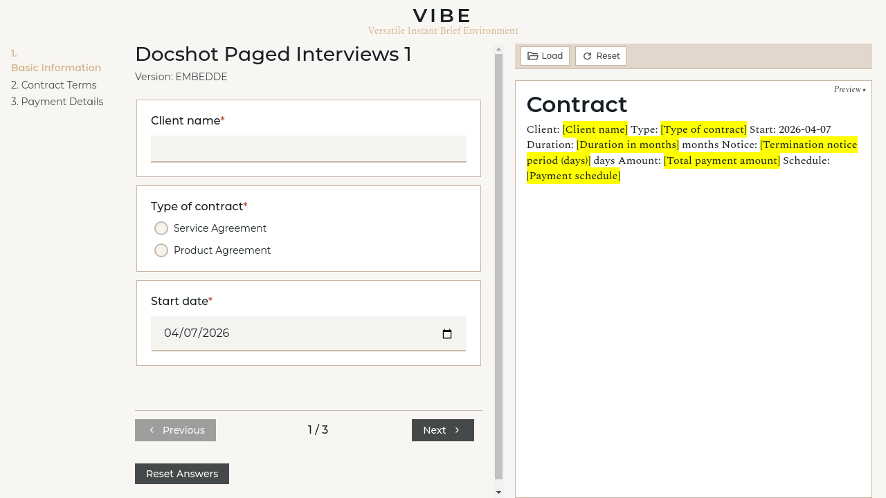
basics:
title: Basic Information
description: Start with the fundamentals
questions:
client_name:
type: text
label: Client name
contract_type:
type: radio
label: Type of contract
options:
- value: service
label: Service Agreement
- value: product
label: Product Agreement
start_date:
type: date
label: Start date
terms:
title: Contract Terms
questions:
duration:
type: number
label: Duration in months
renewal_option:
type: bool
label: Include auto-renewal clause?
termination_notice:
type: number
label: Termination notice period (days)
payment:
title: Payment Details
questions:
payment_amount:
type: number
label: Total payment amount
payment_frequency:
type: radio
label: Payment schedule
options:
- value: upfront
label: 100% upfront
- value: monthly
label: Monthly
late_fee:
type: bool
label: Include late payment fee?
That's it. VIBE automatically:
- Treats each group as a coherent section
- Computes group visibility based on relevance
- Applies
ui.layoutto decide how groups are shown
Page Configuration
Each entry under groups: (keyed by group ID) has:
| Field | Required | Description |
|---|---|---|
title |
Yes | Display title for the group |
description |
No | Optional text shown at the top of the group |
questions |
Yes | Question definitions (same format as standard questions: section) |
Group Status Indicators
When using the paged layout, the TOC sidebar shows a status indicator for each group:
| Status | Indicator | Meaning |
|---|---|---|
| Not Started | ○ Empty circle | Group has relevant questions, none answered yet |
| In Progress | ◐ Half-filled | Some questions answered, or validation errors exist |
| Complete | ● Filled (green) | All required questions in this group are answered |
| Not Relevant | (hidden) | No questions in this group are currently relevant |
Status is computed automatically based on:
- Which questions are relevant (determined by your template logic)
- Which questions have been answered
- Whether there are validation errors
How Grouping Interacts with Relevance
VIBE's probing mechanism works the same way for grouped templates—it scans your entire template to determine which questions are relevant. The difference is only in presentation:
- All questions are probed globally (not per-page)
- Only the layout controls what is shown
- Cross-group dependencies work normally
For example, if answering a question in Group A makes questions in Group C irrelevant, Group C's visibility and status update immediately (and may become hidden if all its questions become irrelevant).
Group Visibility
A group appears in the UI if at least one of its questions is relevant. If all questions in a group become irrelevant (due to user answers), the group is hidden.
Navigation (Paged Layout Only)
When ui.layout: paged, users can navigate between groups in three ways:
- TOC Sidebar - Click any page title to jump directly to it
- Previous/Next Buttons - Navigate sequentially through relevant pages
- Keyboard - Standard tab navigation works within each page
Every navigation action submits the current form data, so answers are never lost when switching pages.
Organizing Your Questions
Keep Related Questions Together
Group questions that logically belong together:
groups:
  parties:
    title: Contract Parties
    questions:
      client_name:
        type: text
        label: Client name
      client_address:
        type: text
        label: Client address
      supplier_name:
        type: text
        label: Supplier name

  scope:
    title: Scope of Work
    questions:
      project_description:
        type: textarea
        label: Project description
      deliverables:
        type: textarea
        label: Deliverables
Order Groups by Workflow
Put foundational questions first—later pages often depend on earlier answers:
groups:
basics:
title: Basic Information
questions:
contract_type:
type: radio
label: Type of contract
options:
- value: service
label: Service
- value: product
label: Product
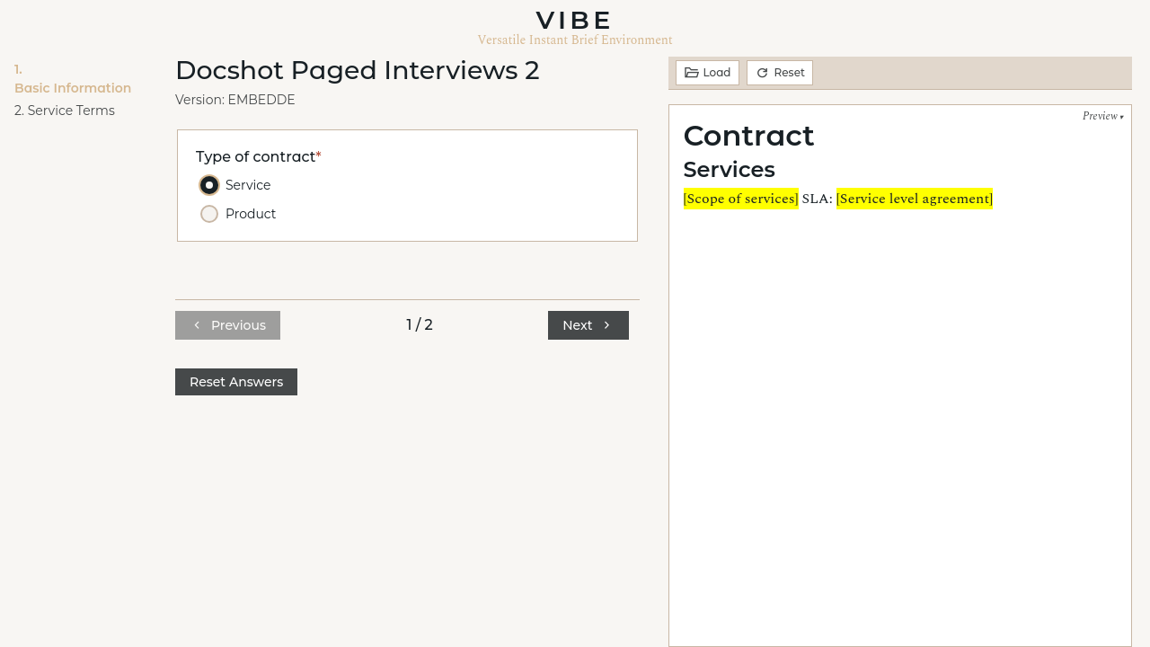
service_terms: # Only relevant if contract_type == 'service'
title: Service Terms
questions:
service_scope:
type: textarea
label: Scope of services
service_level:
type: text
label: Service level agreement
product_terms: # Only relevant if contract_type == 'product'
title: Product Terms
questions:
product_specifications:
type: textarea
label: Product specifications
warranty_period:
type: number
label: Warranty period (months)
Handle Conditional Sections
If a whole section is conditional, create a dedicated page for it. VIBE automatically hides pages when none of their questions are relevant:
groups:
  nda:
    title: Non-Disclosure Terms
    questions:
      nda_duration:
        type: number
        label: NDA duration (years)
      nda_scope:
        type: textarea
        label: Scope of confidentiality
      nda_exceptions:
        type: textarea
        label: Exceptions
        required: false
If your template only uses these NDA variables when include_nda is true, this group only appears when relevant.
Choosing a Layout
Set ui.layout to choose how groups are presented:
ui.layout only affects presentation; it does not change relevance, ordering, or probing behavior.
Preview visibility is independent. Use ui.preview to hide the preview column:
ui:
  layout: paged
  preview: false

groups:
  step1:
    title: Step 1
    questions:
      name:
        type: text
        label: Your name
      email:
        type: text
        label: Email address
  # ...
Styling Grouped Interviews
The grouped layouts use these CSS classes for customization:
| Element | Class | Purpose |
|---|---|---|
| Grouped Container | .grouped-questions |
Wrapper for grouped layouts |
| Accordion Section | .group-section--accordion |
Accordion group container |
| Tabs Shell | .grouped-questions--tabs |
Tabs layout wrapper |
| Flat Group | .grouped-questions--flat |
Flat layout wrapper |
| Paged Container | .main-container--paged |
Three-column layout wrapper |
| TOC Sidebar | .toc-sidebar |
Left sidebar containing navigation |
| TOC Items | .toc-link |
Individual group links |
| Current Group | .toc-link--current |
Highlighted current group |
| Status Indicators | .toc-status--not_started, .toc-status--in_progress, .toc-status--complete |
Group status dots |
| Navigation | .page-navigation |
Prev/Next button container |
| Nav Buttons | .page-nav-btn |
Previous and Next buttons |
Override these in your template's ui.css file. See UI Customization Guide for details on template-specific styling.