The Question Types Reference
The type key for each question in your config.yml tells VIBE what kind of input to show the user. Here is a reference for all available types.
If you want a guided path rather than a lookup reference, start with Building a VIBE Template: A Step-by-Step Tutorial, then use Common Recipes when you need a pattern to adapt.
Common Attributes
Most question types share a set of common configuration keys.
| Key | Type | Required? | Description |
|---|---|---|---|
label |
string | Yes | The user-facing text for the question. |
type |
string | Yes | The type of question widget to display (e.g., text, number). |
required |
boolean | No | Controls required validation, completion gating, and required UI markers. Defaults to true (fields with a default still count as optional for completion). |
default |
any | No | A default value to pre-fill the answer with. |
help |
string | No | Longer, more detailed helper text that appears with the question. Can contain Markdown and Jinja expressions (e.g. {{ kb_link("page", "link text") }} to link to a knowledge base article). |
hint |
string | No | A short hint that often appears as placeholder text inside the input field. |
preview |
string | No | Text to show in the document preview when this question is unanswered. Defaults to label. Use this when the label is a prompt ("Ange sökandes namn") but the preview should show a shorter placeholder ("Sökande"). |
followups |
dict or list | No | Defines follow-up questions that appear when certain conditions are met. Format varies by type — see individual type sections below for details. |
disabled_note |
string | No | When set, the question (or option) is rendered as disabled instead of hidden when irrelevant. The note text is shown to explain why. Works on both questions and individual options. |
# Example showing all common attributes
questions:
  project_code:
    label: Project Code
    type: text
    required: false
    default: PROJ-2024
    help: The internal code for tracking this project, like `PROJ-2024-FIN`. Can be found in the project charter.
    hint: e.g., PROJ-2024-FIN
    preview: Project Code   # shown in document preview when unanswered
Note: Required validation only kicks in after a field is submitted/answered (to avoid blocking every auto-submit), and newly relevant fields are only auto-validated when required: true.
options Format
The options key is used by radio, select, and multichoice to define the available choices. It accepts two formats that can be freely mixed within the same list.
Simple string format — the string is used as both the stored value and the display label:
Object format — for separate values and labels, help text, or followups:
options:
  - value: standard
    label: Standard Plan
  - value: premium
    label: Premium Plan
    help: Includes priority support and SLA guarantees.
    followups:
      - premium_contact
| Key | Type | Required? | Description |
|---|---|---|---|
value |
string | Yes | The stored value (what your template sees). Required when using object format. |
label |
string | No | The display text shown to the user. Defaults to value if omitted. |
help |
string | No | Explanatory text shown with the option. Supported by radio and multichoice only — causes a validation error on select. |
followups |
list | No | List of question IDs to render nested under this option (instead of as standalone questions). See Follow-up Questions below. |
followup |
string | No | Convenience alias — a single question ID, equivalent to followups: [id]. |
You can mix both formats in one list:
options:
  - Simple Option                  # string → value and label are both "Simple Option"
  - value: detailed
    label: Detailed Option
    help: This one has extra metadata.
Follow-up Questions
Follow-up questions control placement, not relevance. Listing a question ID in followups tells VIBE: "when this question is relevant, render it nested under this option instead of as a standalone top-level question." Whether the question is relevant at all is still determined by your template's {% if %} logic via the probing mechanism.
In practice, selecting the parent option usually does make the followup relevant — because your template typically guards it with {% if delivery_method == "courier" %}{{ courier_company }}{% endif %}. But it's the template that makes that connection, not the followups key itself.
For larger nested structures where followups start to feel like mini-sections, see Reuse with Components and Reusable Data with definitions.
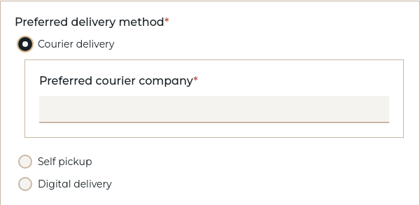
Per-option followups (multichoice, radio, select)
For option-based types, add a followups list to any option object. When the listed questions are relevant, they appear nested underneath that option.
questions:
  delivery_method:
    type: radio
    label: Preferred delivery method
    options:
      - value: courier
        label: Courier delivery
        followups:
          - courier_company
      - value: pickup
        label: Self pickup
      - value: digital
        label: Digital delivery
        followups:
          - download_format

  courier_company:
    type: text
    label: Preferred courier company

  download_format:
    type: select
    label: Download format
    options:
      - PDF
      - DOCX
For bool and tristate per-option followups, see the bool and tristate sections below.
Question-level followups (any type)
Any question — regardless of type — can have a followups list directly on the question definition. These followup questions are rendered nested directly underneath the parent question as a whole (rather than under a specific option).
questions:
  project_budget:
    type: number
    label: Project Budget
    followups:
      - budget_justification

  budget_justification:
    type: text
    label: Budget Justification
This is useful when a followup relates to the parent question's value rather than a specific option choice — for example, asking for justification when a budget exceeds a threshold:
Budget: {{ project_budget }}

{% if project_budget and project_budget > 100000 %}
Justification: {{ budget_justification }}
{% endif %}
Note: Followup questions must be defined as regular questions in the same questions block. They are rendered inside the parent widget instead of as standalone top-level questions. Followups can be nested — a followup question can itself have followups.
Shorthand: followup (singular)
When there is only a single followup question, you can use followup with a plain string instead of followups with a one-item list. This is purely a convenience alias — VIBE normalizes it to followups: [id] at load time.
options:
  - value: courier
    label: Courier delivery
    followup: courier_company     # equivalent to followups: [courier_company]
  - value: digital
    label: Digital delivery
    followups:                    # use the list form for multiple followups
      - download_format
      - delivery_email
The same shorthand works on question-level followups:
questions:
  project_budget:
    type: number
    label: Project Budget
    followup: budget_justification  # equivalent to followups: [budget_justification]
text / textarea / email / password
For freeform text input. Use textarea for longer, multi-line text. Use email for email addresses with built-in format validation. Use password for masked input (characters are hidden as the user types).
questions:
  project_name:
    type: text
    label: Project Name

  project_description:
    type: textarea
    label: Project Description
    help: Provide a brief summary of the project goals.
    required: false

  contact_email:
    type: email
    label: Contact Email
    help: We'll use this email for follow-up communication.
    required: false

  api_token:
    type: password
    label: API Token
    help: This value will be masked in the interview but included in the generated document.
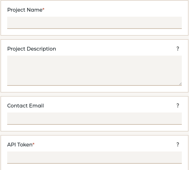
Notes on email: Validates that the input matches a standard email format (e.g., user@example.com). Invalid addresses produce a validation error.
Notes on password: Characters are hidden in the interview form, but the value is stored and used in templates as plain text -- this is a UI convenience, not a security feature.
assisted
An enhanced textarea that includes an AI-powered assist button to help the user draft text. It is ideal for fields requiring creative or descriptive content.
Extension note: assisted is part of the Assistant extension and requires LLM endpoints to be configured.
| Key | Type | Required? | Description |
|---|---|---|---|
type |
string | Yes | Must be set to assisted. |
label |
string | Yes | The user-facing text for the question. |
prompt |
string | Yes | A Jinja2 template string that will be rendered and sent to the LLM as its instruction. |
model |
string | No | The ID of the LLM endpoint to use, as defined by the administrator in the system config.yml. If omitted, the system default is used. |
Example:
questions:
  procurement_object:
    type: text
    label: What do you want to buy?

  procurement_description:
    type: assisted
    label: Describe the thing you want to buy
    model: claude-opus
    prompt: Create a one-paragraph description of {{ procurement_object }} suitable for a procurement process.
User Interaction:
- The user can type in the text area manually.
- Clicking the assist button sends the rendered
promptto the specified LLM. - The AI's response is streamed directly into the text area.
- If the button is clicked again, the user is prompted for refinement instructions, and the AI generates a new version based on the original prompt, the current text, and the new instructions.
Template Access:
In your .md or .docx template, an assisted variable behaves exactly like a standard text variable. You access its final content with {{ procurement_description }}.
number
For numeric input. You can specify min and max values for validation.
questions:
  contract_duration:
    type: number
    label: Contract Duration (months)
    min: 1
    max: 60
    help: Enter the length of the contract in full months.
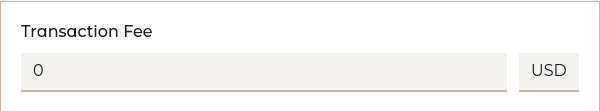
amount
For monetary values, combining a numeric input with a currency.
Fixed Currency Example: If you provide only one currency, it will be displayed as a static symbol or code next to the number input.
questions:
  project_budget:
    type: amount
    label: Project Budget
    min: 0
    currencies:
      - USD
    currency_position: left
Selectable Currency Example: If you provide multiple currencies, a dropdown menu will appear for the user to select from.
questions:
  transaction_fee:
    type: amount
    label: Transaction Fee
    required: false
    currencies:
      - USD
      - EUR
      - GBP
amount Specific Options:
| Key | Type | Description |
|---|---|---|
currencies |
list | A list of allowed currency codes (e.g., ["USD", "EUR"]). If only one is provided, the currency is fixed. |
min |
number | The minimum allowed numeric value. |
max |
number | The maximum allowed numeric value. |
currency_position |
string | left (default) or right. Where to display a fixed currency symbol. |
currency_symbol |
string | Manually override the currency symbol (e.g., "$"). By default, it's looked up from a standard map. |
Template Access:
An amount variable is automatically formatted for printing. You can also access its parts.
The total budget is {{ project_budget }}.

Value: {{ project_budget.value }}
Currency: {{ project_budget.currency }}
bool
For a simple "Yes" or "No" choice, rendered as radio buttons.
questions:
  include_nda:
    type: bool
    label: Does this project require an NDA?
    default: true
    required: false
Customizing option labels:
questions:
  invest:
    type: bool
    label: Should the company proceed with the investment?
    true_label: "Ja, genomför investering"
    false_label: "Nej, avbryt"
| Key | Type | Description |
|---|---|---|
true_label |
string | Label for the "Yes" option (default: "Yes"). |
false_label |
string | Label for the "No" option (default: "No"). |
Followups: bool supports per-option followups keyed by yes and/or no. The followup questions are rendered nested under the corresponding radio button.
questions:
  needs_insurance:
    type: bool
    label: Does the shipment require insurance?
    followups:
      yes:
        - insurance_amount
      no:
        - waiver_reason

  insurance_amount:
    type: amount
    label: Insurance coverage amount
    currencies:
      - USD

  waiver_reason:
    type: text
    label: Reason for declining insurance
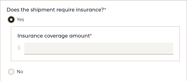
With the singular shorthand, the above can also be written as:
  needs_insurance:
    type: bool
    label: Does the shipment require insurance?
    followup:
      yes: insurance_amount
      no: waiver_reason
tristate
For a three-way choice: "Yes", "No", or "Don't know", rendered as radio buttons. Use this when you need to distinguish between "No" and "uncertain/not applicable/don't know".
questions:
  is_international:
    type: tristate
    label: Is this an international transaction?
    help: Select "Don't know" if you're unsure or if this doesn't apply.
Customizing the third option label:
questions:
  requires_legal_review:
    type: tristate
    label: Does this require legal review?
    none_label: Not applicable

  has_data_privacy_concerns:
    type: tristate
    label: Are there data privacy concerns?
    none_label: Maybe
    required: true
Customizing option labels:
All three option labels are customizable:
questions:
  approval:
    type: tristate
    label: Approval decision
    true_label: "Godkänn"
    false_label: "Avslå"
    none_label: "Skjut upp beslut"
tristate Specific Options:
| Key | Type | Description |
|---|---|---|
true_label |
string | Label for the "Yes" option (default: "Yes"). |
false_label |
string | Label for the "No" option (default: "No"). |
none_label |
string | Label for the third option (default: "Don't know"). Use values like "Not applicable", "Maybe", "Uncertain", etc. |
default |
boolean or null | Default selection: true for Yes, false for No, null for the third option, or omit to leave unselected. |
Template Access:
A tristate variable has three possible values: true, false, or none (Python None). All three are valid answers that satisfy required: true.
{% if is_international is true %}
This is an international transaction.
{% elif is_international is false %}
This is a domestic transaction.
{% elif is_international is none %}
The international status is unknown.
{% endif %}
Important: Always use the is operator with true, false, or none when checking tristate values. Other comparison operators are not supported and will cause validation errors.
Followups: Like bool, tristate supports per-option followups — but with three keys: yes, no, and none (matching the third option, whatever its label).
questions:
  risk_assessment:
    type: tristate
    label: Are there identified risks?
    none_label: Not assessed yet
    followups:
      yes:
        - risk_mitigation
      no:
        - risk_waiver
      none:
        - risk_evaluation

  risk_mitigation:
    type: text
    label: Describe mitigation strategy

  risk_waiver:
    type: text
    label: Reason risk is acceptable

  risk_evaluation:
    type: text
    label: When will risk assessment be completed?

When to use tristate vs bool:
- Use
boolwhen you need a definitive yes/no answer and uncertainty should block progress - Use
tristatewhen "don't know" or "not applicable" is a valid, meaningful answer that allows the document to proceed
date
For collecting a date from a calendar picker. Dates are in YYYY-MM-DD format.
radio / select
For a list of choices where the user can only choose one option. Supports per-option followups.
questions:
  contract_type:
    type: radio
    label: Contract Type
    options:
      - value: premium
        label: Premium Support
        help: Includes 24/7 phone support.
      - value: standard
        label: Standard Support
        help: Email support with a 48-hour response time.
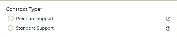
Use radio for a set of radio buttons (all options always visible). Use select for a dropdown menu (the help attribute cannot be used with select).
You can also override the rendering style with render_as without changing the question type:
  delivery_method:
    type: select
    render_as: radio    # Renders as radio buttons instead of a dropdown
    label: Delivery Method
    options:
      - Standard
      - Express
      - Overnight
multichoice
For a list of checkboxes where the user can select multiple options. Supports per-option followups.
questions:
  service_scope:
    type: multichoice
    label: Services Included
    required: false
    options:
      - Discovery & Strategy
      - UI/UX Design
      - Backend Development
      - Ongoing Support

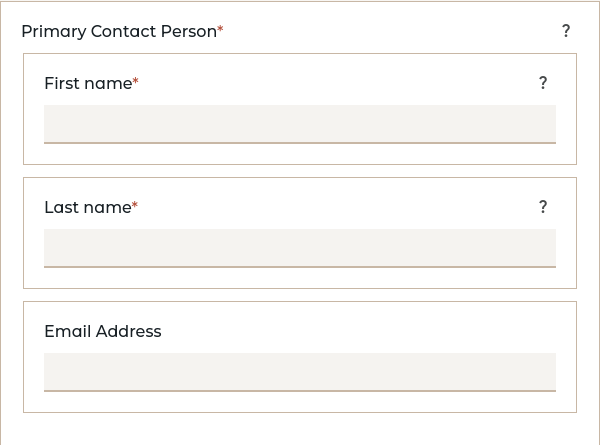
structured
For collecting complex, nested data structures based on definitions. Structured questions create grouped fields with dot notation form names.
Basic structured question using a definition:
questions:
  primary_contact:
    label: Primary Contact Person
    type: structured
    definition: person_definition
    help: Main person responsible for this project
definitions:
  person_definition:
    first_name:
      label: First name
      type: text
      help: Enter the person's first (or given) name
    last_name:
      label: Last name
      type: text
      help: Enter the person's last name (surname)
    email:
      label: Email Address
      type: email
      required: false
Template access with dot notation:
**Contact:** {{ primary_contact.last_name }}, {{ primary_contact.first_name }}
**Email:** {{ primary_contact.email }}
Form field naming: Structured fields use dot notation (primary_contact.full_name, billing_address.street) to avoid namespace collisions.
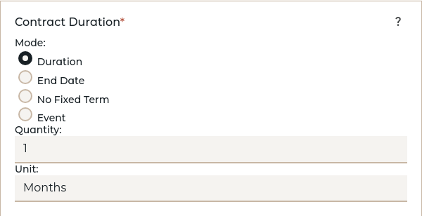
period
For collecting time periods in four modes: duration (quantity + unit), until (end date), indefinite (no end), or event (event-based). Period questions create sophisticated time-based inputs with validation, date arithmetic, and template access patterns.
All Modes Available (Default Behavior):
By default, all four modes are available to users unless restricted via the modes property.
questions:
  contract_duration:
    label: Contract Duration
    type: period
    default_mode: duration
    default_unit: months
    min_quantity: 1
    max_quantity: 60
    help: How long should this contract last?
Restricting Available Modes:
Use the modes property to limit which modes users can choose from.
questions:
  project_deadline:
    label: Project Deadline
    type: period
    modes:
      - until
    min_date: 2024-01-01
    max_date: 2030-12-31
    help: When must the project be completed by?
Multiple Modes with Constraints: Allow specific modes and configure each one appropriately.
questions:
  service_term:
    label: Service Term
    type: period
    modes:
      - duration
      - indefinite
    duration_units:
      - weeks
      - months
      - years
    default_mode: duration
    default_unit: months
    min_quantity: 1
    max_quantity: 36
    required: false
    help: Choose a fixed duration or indefinite service term
Event Mode Configuration: For periods that end when a specific event occurs.
questions:
  project_phase:
    label: Project Phase Duration
    type: period
    modes:
      - duration
      - event
    default_mode: event
    duration_units:
      - days
      - weeks
    allowed_events:
      - milestone completion
      - budget approval
      - client signoff
    required: false
    help: When does this phase end?
Period Configuration Options:
| Key | Type | Description |
|---|---|---|
modes |
array | List of allowed modes: ["duration", "until", "indefinite", "event"]. Defaults to all four modes. |
default_mode |
string | Which mode to pre-select. Must be one of the allowed modes. Defaults to "duration" if available. |
duration_units |
array | List of allowed units for duration mode: ["days", "weeks", "months", "years"]. Defaults to all units. |
default_unit |
string | Which unit to pre-select for duration mode. Must be one of the allowed duration_units. Defaults to "months". |
min_quantity |
number | Minimum allowed quantity for duration mode (default: 1). |
max_quantity |
number | Maximum allowed quantity for duration mode (optional). |
min_date |
string | Earliest allowed date for until mode in YYYY-MM-DD format (optional). |
max_date |
string | Latest allowed date for until mode in YYYY-MM-DD format (optional). |
allowed_events |
array | List of allowed event names for event mode (optional). |
Template Usage: Periods are accessed as structured objects with mode-specific properties and convenience methods.
{% if contract_duration %}
**Contract Duration:** {{ contract_duration.display }}

{% if contract_duration.is_duration %}
  Duration: {{ contract_duration.quantity }} {{ contract_duration.unit }}
{% elif contract_duration.is_until %}
  End Date: {{ contract_duration.date }}
{% elif contract_duration.is_indefinite %}
  No fixed end date
{% elif contract_duration.is_event %}
  Ends when: {{ contract_duration.event }}
{% endif %}
{% endif %}
Date Arithmetic: Duration periods can be added to dates for calculations.
{% if start_date and duration_period and duration_period.is_duration %}
**Start Date:** {{ start_date }}
**Duration:** {{ duration_period }}
**End Date:** {{ start_date + duration_period }}
{% endif %}
Available Properties:
period.mode- One of "duration", "until", "indefinite", or "event"period.display- Enhanced formatted string (e.g., "6 months", "until August 15, 2025", "indefinitely")
Convenience Properties:
period.is_duration- Boolean: true if mode is "duration"period.is_until- Boolean: true if mode is "until"period.is_indefinite- Boolean: true if mode is "indefinite"period.is_event- Boolean: true if mode is "event"
Mode-Specific Properties:
- For duration mode:
period.quantity- The numeric duration (e.g., 12)period.unit- The time unit (e.g., "months")
- For until mode:
period.date- The end date in YYYY-MM-DD format (e.g., "2025-12-31")
- For event mode:
period.event- The event name (e.g., "project completion")
Built-in String Formatting: Periods automatically format to readable text when used directly in templates:
- Duration mode: "12 months", "1 year", "3 weeks"
- Until mode: "until 2025-12-31" or "until August 15, 2025"
- Indefinite mode: "indefinitely"
- Event mode: "until project completion"
Validation Rules:
- Duration mode: Quantity must be a positive number within specified min/max bounds
- Until mode: Date must be valid YYYY-MM-DD format within specified date range
- Event mode: Event name must be provided; if
allowed_eventsis specified, must be from that list - Indefinite mode: No additional validation required
- Required validation: If required=true, user must provide a complete period value
Common Patterns:
# Flexible period with all modes available (default behavior)
project_timeline:
  label: Project Timeline
  type: period
  default_mode: duration
  default_unit: weeks
  min_quantity: 1
  max_quantity: 104
  help: Choose duration, end date, indefinite, or event-based

# Date-only period for deadlines
submission_deadline:
  label: Submission Deadline
  type: period
  modes:
    - until
  min_date: 2024-06-01
  max_date: 2024-12-31
  help: Final date for submission

# Duration-only period for contracts
service_period:
  label: Service Period
  type: period
  modes:
    - duration
  duration_units:
    - months
    - years
  default_unit: months
  min_quantity: 3
  max_quantity: 36
  help: Length of service commitment

# Event-based period with constrained options
warranty_period:
  label: Warranty Period
  type: period
  modes:
    - event
  allowed_events:
    - first failure
    - one year elapsed
    - contract termination
  help: When does the warranty coverage end?

# Duration or indefinite for ongoing arrangements
maintenance_agreement:
  label: Maintenance Agreement Duration
  type: period
  modes:
    - duration
    - indefinite
  duration_units:
    - months
    - years
  default_mode: indefinite
  help: Duration of ongoing maintenance coverage
list
For collecting multiple items of the same structure. Lists can use either inline field definitions (itemdef) or definition references (uses).
List with inline fields — simple case:
For a list where each item has just one or two fields, define them inline with itemdef:
questions:
  keywords:
    label: Keywords
    type: list
    item_label: Keyword
    itemdef:
      keyword:
        label: Keyword
        type: text
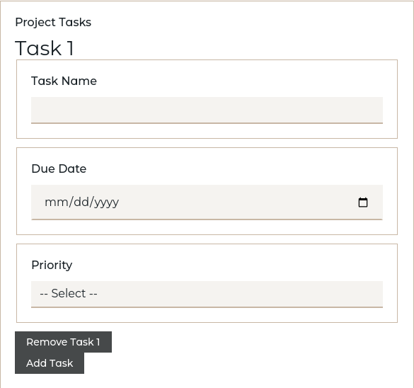
List with inline fields — multiple fields:
Inline definitions can have any number of fields:
questions:
  project_tasks:
    label: Project Tasks
    type: list
    item_label: Task
    required: false
    itemdef:
      name:
        label: Task Name
        type: text
      due_date:
        label: Due Date
        type: date
        required: false
      priority:
        label: Priority
        type: select
        options:
          - Low
          - Medium
          - High
{% for task in project_tasks %}
- **{{ task.name }}** - Due: {{ task.due_date }} (Priority: {{ task.priority }})
{% endfor %}
List using a definition:
When the item structure is complex or reused across multiple lists, define it separately with definitions and reference it with uses:
definitions:
  person_definition:
    first_name:
      label: First Name
      type: text
    last_name:
      label: Last Name
      type: text
    email:
      label: Email
      type: email
      required: false

questions:
  team_members:
    label: Team Members
    type: list
    item_label: Team Member
    uses: person_definition
    min_items: 1
    max_items: 10
{% for member in team_members %}
- **{{ member.last_name }}**, {{ member.first_name }} ({{ member.email }})
{% endfor %}
List options:
itemdef: Inline field definitions for each item (mutually exclusive withuses)uses: Reference to a definition name for item structure (mutually exclusive withitemdef)item_label: Singular label for each item (e.g., "Team Member")min_items: Minimum number of items requiredmax_items: Maximum number of items allowed
For more details on structured questions and lists, see Reusable Data with definitions. If the repeated thing is a document section rather than a data shape, use Reuse with Components instead.
computable
For values that are calculated automatically from other answers. Computable variables have no input widget -- they don't appear in the interview form. Instead, their values are derived from expressions or functions.
questions:
  base_price:
    type: number
    label: Base Price

  tax_rate:
    type: number
    label: Tax Rate (%)
    default: 8.5

  tax_amount:
    type: computable
    compute: "base_price * tax_rate / 100"

  total:
    type: computable
    compute: "base_price + tax_amount"
| Key | Type | Required? | Description |
|---|---|---|---|
compute |
string | * | A Python expression that calculates the value. Mutually exclusive with compute_function. |
compute_function |
string | * | Name of a function in computations.py that calculates the value. Mutually exclusive with compute. |
Exactly one of compute or compute_function must be specified. Dependencies on other variables are detected automatically -- you don't need to declare them.
For the complete guide including function-based computations, conditional logic, and advanced patterns, see Automated Calculations with Computable Variables.
note / warning / error (Messages)
For displaying read-only messages in the interview. These are not input fields -- they show information, warnings, or error notices to the user based on their answers so far. Messages are controlled by template logic: they appear when the template references them inside an active conditional block.
questions:
  project_type:
    type: select
    label: Project Type
    options:
      - standard
      - high_risk

  risk_warning:
    type: warning
    label: High-Risk Project
    content: >
      This project type requires additional compliance review.
      Please allow an extra 2-4 weeks for processing.

  standard_note:
    type: note
    label: Information
    content: Standard projects follow the normal approval process.
| Key | Type | Required? | Description |
|---|---|---|---|
type |
string | Yes | One of: note, warning, or error. |
label |
string | Yes | Title/heading for the message block. |
content |
string | Yes | The message text to display. Supports Markdown. |
Controlling when messages appear: Messages follow the same relevance rules as any other question. Use conditional blocks in your template to control when they show up:
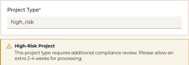
The message will appear in the interview form when its variable is accessed in an active part of the template. Each type has distinct visual styling: note appears as a neutral informational box, warning as a highlighted caution, and error as a prominent alert.